This article has been written by expert contributor, TDM Growth Partners.
As in previous years, Tom Cowan and Andy Simon have been furiously working behind the scenes to produce our annual memo to clients articulating our views on where we think we are in the market cycle and explain accordingly how offensively or defensively we are positioning the portfolio. You can find Tom and Andy on LinkedIn.
Dear Clients,
Thank you for another year of continued support.
The last 12 months have undoubtedly been challenging. A lot has been thrown at us and our businesses, including a rapid 400bps increase in interest rates, a more challenging macro-economy and a global banking crisis. As the stewards of your capital, we continue to feel a huge responsibility to navigate these periods of volatility with calmness and clarity. Considering the circumstances, we are pleased the portfolio has increased in value by 15% this financial year but more importantly, 117% over the last 3 years (March 2020-2023).
The purpose of our annual market memo is to articulate our views on where we are in the market cycle and explain accordingly how offensively or defensively we are positioning the portfolio. This memo is not to predict if markets will go up or down in the next year – as you know, we do not try to time markets or make investment decisions based on macro or other market-wide dynamics.
Our first TDM market memo, released in February 2021, presented a view that growth company valuation multiples were excessive and imputing unrealistic expectations of future growth. As it turned out, the release of that memo coincided with peak valuations for these companies.
In February 2022, our next market memo (a year and a significant share price drawdown later) presented a view that valuations and associated growth expectations had come back to earth and that it was a good time to be selectively purchasing high-quality growth assets.
While it turns out we were early in starting to deploy capital, we continue to standby this approach. We believe the best way to deploy capital into the public markets is slowly and methodically (over many months). We never attempt to pick the bottom. We focus on owning great businesses at what we believe are wonderful prices.
We have never been more excited by the return potential of the portfolio. Our largest positions, accounting for over 70% of the portfolio, have bulletproof balance sheets. On a weighted average basis, these businesses are trading on less than 5x next twelve months (NTM) revenue and less than 25x EBITDA with forecast revenue growth in excess of 45%.
The analysis in this memo describes what we believe is a simple truth: If we own high quality businesses at great prices, time is our friend. We look at growth company data from both the Dot Com Crash and Global Financial Crisis time periods, the other major market meltdowns over the past two decades (excluding the sharp but brief COVID correction in March 2020). In both instances, growth companies outperformed the market by a big distance in the subsequent years.
Patience and emotional stability at these times are our core competitive advantages. These are the most important times for us to judiciously deploy capital. This has been the approach over the last 12 months. We are currently 95% invested and 5% cash. This is a relatively offensive position compared to the 15-20% average cash weighting over the last 18 years.
To be clear, we by no means believe we are ‘out of the woods’ either economically or in regard to equity market performance. But all bear markets end. When it happens, we believe our portfolio of businesses will generate very strong returns well in excess of the 25% per annum we have delivered since inception.
We hope you find this analysis interesting. If you would like to discuss anything further, please always give us a call.
Tom and Andy
Our methodology for comparing the market across eras
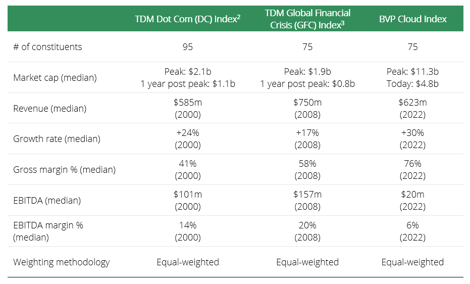
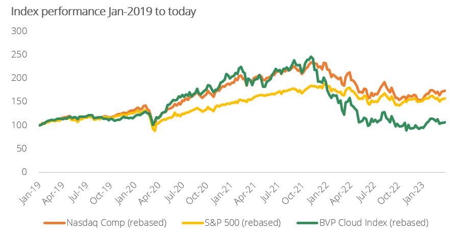
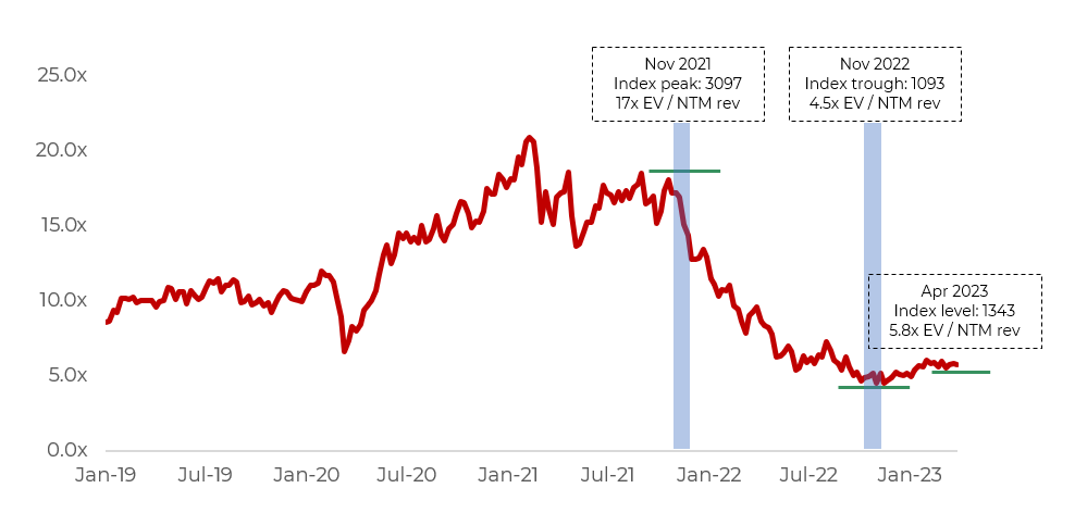
As you know, our favourite public index to track the performance of high growth software businesses is the Bessemer Venture Partners (‘BVP’) Cloud Index. Unfortunately, this index began in 2013 and only a single member of the index – Adobe – existed during the Dot Com era and two – Adobe and Salesforce – during the Global Financial Crisis. This means we cannot use this index for our longer dated, historical deep dives.
As a proxy though, we have created our own ‘Dot Com’ and ‘Global Financial Crisis’ (GFC) indices, consisting of a selection of high growth software and technology businesses that were publicly listed at the time.
The table below shows key metrics for both the Dot Com and GFC indices during the relevant periods and the BVP index today. While not a perfect comparison, we think these indices are comparable enough to draw some meaningful conclusions.
Where are we today?
Equity markets peaked in late 2021 / early 2022. The table below shows the market movements for the S&P 500, the Nasdaq Composite Index (both market capitalisation weighted) and the BVP Cloud Index (equally weighted) from peak levels. The first two are representative of broad market performance compared to the exclusively growth software focused BVP Index.
While we use the term ‘trough’ in the table below, we are not saying share prices won’t fall further – this simply refers to the most recent trough.
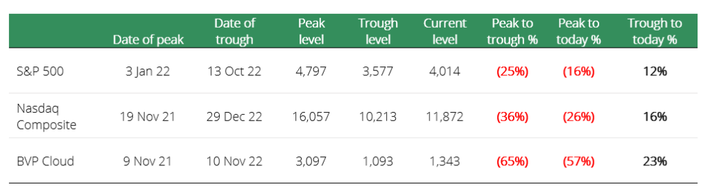
The biggest takeaway is that the highest growth businesses peaked earlier and have fallen substantially more than the broader market: The BVP Cloud Index has fallen 65% compared to 16% and 26% respectively for the S&P 500 and Nasdaq Composite. While the magnitude of the decline is stark, it is not surprising that these businesses are more volatile than the market. They are typically earlier stage, growing at higher rates and trade at higher multiples, making them more susceptible to shifts in sentiment.
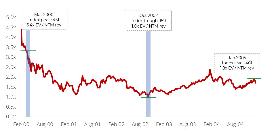
The Dot Com era – what can we learn from the data?
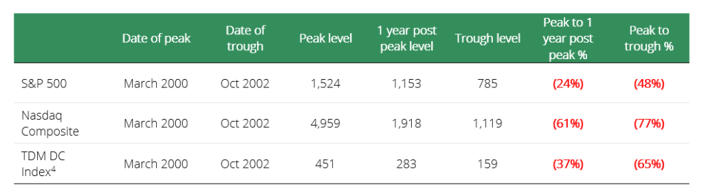
The Dot Com drawdown was long and severe. Markets peaked in March 2000 and didn’t bottom until October 2002 – a full two and a half years later. Coincidently, the TDM ‘DC Index’ had a peak-to-trough decline of 65%, exactly the same as the BVP Index today. Unlike today, however, the Nasdaq Composite fell by almost 80%, more than the TDM DC Index.
In our last memo, we looked to explain how the Nasdaq in 2000 was outrageously overvalued relative to the quality of revenue and earnings of the largest constituents.
‘Exhibit 3 shows a series of metrics for 10 of the largest software and technology businesses at the peak of the market in early 2000. Most of these are household names, and all but Sun Microsystems, Yahoo and Siebel Systems remain listed today. While these were all real businesses, generating real revenue and gross profits and growing at attractive rates, the valuations were crazy taking into account the quality of the revenue streams (i.e. non-recurring). The average business in this group was trading at 27x NTM revenue, or 19x excluding Yahoo as an outlier.
Besides Oracle with its large maintenance and services revenue, these businesses were largely devoid of the recurring subscription revenues that define the modern SaaS business. Microsoft generated the majority of its revenue selling licensed versions of its Windows and Office software, Cisco primarily sold hardware for networking purposes and Qualcomm sold chips for wireless handsets. Exactly what they were selling doesn’t matter, the point is that most of their revenue started at zero each year.’
With that context, it is important to look at what happened in the lead-up to the Dot Com crash and the recovery period to be able to better compare it to other significant drawdowns.
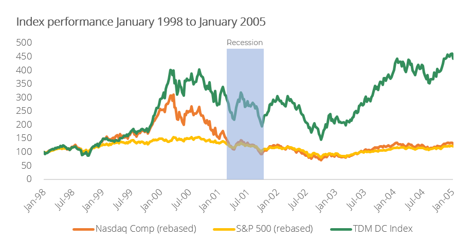
The two years prior to the market peak in March 2000 saw one of the strongest bull markets for growth companies on record, with the Nasdaq increasing approximately 3x while the TDM DC Index increased by 4x. Much of this increase happened in the final six months of the bull market when both the Nasdaq and the TDM DC Index doubled in what is often described as a ‘melt-up’. The S&P 500 on the other hand had a much more measured move over this period.
We noted earlier that the TDM DC Index fell less than the Nasdaq and bottomed around the same time. It’s what happened after that caught our attention. The TDM DC Index had a much sharper recovery than both the Nasdaq and the S&P 500. One year after the bottom, the TDM DC index was up 140% compared to the Nasdaq at 70% and the S&P 500 at 30%.
This outperformance continued well beyond the one-year mark and the TDM DC Index recovered its previous peak by January 2004, less than four years later. Compare this to the Nasdaq which didn’t recover its peak until April 2015, an astounding 15 years later!
We believe this reflects the superior underlying fundamentals of the businesses in the index relative to the broader market. Also, as an equal-weighted index, its performance will better reflect the performance of each individual constituent, compared to a market cap-weighted index where the biggest companies will account for a higher portion of the performance.
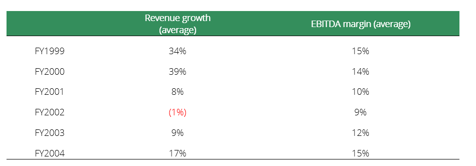
The table below shows the average growth rates and EBITDA margins for the TDM DC Index businesses. After experiencing a significant deceleration in 2001 and 2002, these businesses re-accelerated in 2003 and again in 2004. Margins followed the same trajectory, experiencing a dip and then a recovery. Interestingly, the market bottoming happened before the improvement in fundamentals – this is exactly how functioning equity markets are supposed to work.
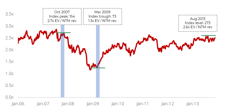
What happened during the Global Financial Crisis?
The GFC was a truly gut-wrenching period. Those that were investing during the GFC will recall the extreme volatility and uncertainty that prevailed at the time. For a few weeks in September 2008, many of the brightest minds in the industry were predicting the end of the modern financial system as we know it. Fortunately, the modern financial system didn’t end, and the period immediately post the GFC was one of the strongest bull markets on record.
Those who were TDM clients at the time would be forgiven for wiping this period from their memories. The TDM portfolio experienced a peak-to-trough decline of 35%. Fortunately, with the support of all of you – we were able to deploy capital throughout this entire period. Over the course of 18 months, we deployed 37% of the fund into several outstanding businesses we knew well. We didn’t pick the bottom – far from it. But we were able to buy at what proved to be extremely attractive prices – following this decline, the portfolio then increased by 135% in the next 2 years. To be able to methodically deploy capital amongst the chaos set up the portfolio up better for many years to come, with the portfolio increasing 5x in the following 6 years.
The GFC peak-to-trough period was approximately 18 months. It was a major global economic contraction that impacted almost all businesses. This is reflected in the peak-to-trough declines of c.55% for all three of the indices in the table below (exhibit 7). Interestingly, for growth companies the drawdowns were not as savage as the Dot Com era or the current period.
However, the consistency of the drawdowns across all three indices masks considerable differences in the performance of the indices during the recovery period.

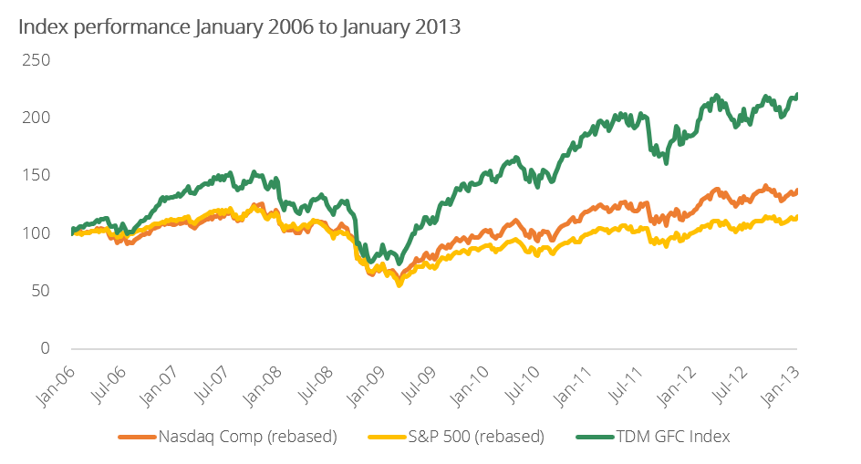
The period leading up to the GFC was a healthy, if not uneventful, bull market with the S&P 500 and the Nasdaq both gaining approximately 25% from the start of January 2006 to the peak in October 2007. The TDM GFC Index (our growth company index analogous to the BVP Cloud Index) outpaced the market indices, increasing by approximately 55% over this period.
While all three indices had similar peak-to-trough declines, what stands out is the recovery that followed the trough. One year post the market bottom, the S&P 500 was up 70%, the Nasdaq was up over 80% and the TDM GFC Index was up approximately 115%. This outperformance was sustained in the following years and by January 2013, the TDM GFC Index had increased over 200% compared to 115% for the S&P 500 and 145% for the Nasdaq.
What accounts for the outperformance of our index compared to the market indices? Again, the answer is the underlying business fundamentals.
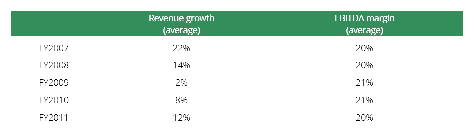
As the table below shows, the businesses in the TDM GFC index experienced a material deceleration in revenue growth during the GFC period and then re-accelerated in the recovery period. Margins were relatively flat during this period, a surprising result given the revenue slowdowns.
What is interesting though as it relates to the market, is that the majority of the share price outperformance actually occurred immediately post the market bottom. Again, the market was going through its ‘weighing process’ but this time the results were more mixed across indices. This is normal and healthy and supports the view that once markets find a bottom and stabilise, the business fundamentals matter again.
A note on valuation multiples
As fundamental investors we can’t help ourselves but to ask, ‘but what about valuation multiples?’. This is intended to be a very high-level, top-down view as we wanted to see how valuations responded in both periods relative to the index performance.
In both the Dot Com bubble and the GFC, multiples suffered significant declines – falling more than the indices and at a faster pace. Interestingly, multiples appeared to trough and stabilise before the market bottomed. The most likely explanation of this is that sell-side analyst forecasts change at a slower pace than share prices. Based on our experience, analysts don’t take down their forward estimates during the early stages of the downturn, resulting in valuation multiples that appear ‘cheap’ before the market completely bottoms.
Looking at the current downturn, we see a similar story. Valuations for the BVP index peaked earlier (February 2021) and have fallen more than share prices. In recent months, valuation multiples, along with share prices, have stabilised.
We don’t know what valuations will do from here nor will we try to guess. What we do know is that at current valuations, we believe at the very least returns should equal overall revenue growth on a medium to long term basis. In many instances, there is also the opportunity for valuation multiple re-ratings to the upside, over time as revenue growth and profitability targets are achieved.
A quick investment case study – Salesforce
While we set out to compare periods of recession and market drawdowns – how indices behaved at certain points – as bottom-up investors who lived through the GFC, we really can’t help ourselves from looking at a specific company situation.
We remember these situations like they were yesterday, burnt into our memory, and without doubt shaping how we deploy capital today when times are tough, volatility is high, the portfolio is down, and the headlines are against you.
Salesforce is a classic example from the GFC and a case in point of lessons learnt that shape our methods as to how we are currently behaving.
It was at the time a miss from us, having done our work throughout the 2006-2008 period. The share price peaked in July 2008 at approx. $17 a share after increasing by approx. 100% in the two years prior. The business was growing revenue at over 50%, and trading on an EV/NTM revenue multiple of approx. 6.5x.
Lehman then went bust in September 2008 and the share price then fell 70% to approx. $5.50 by November 2008 and was trading approx. 2x revenue.
The business slowed as the recession hit and revenue grew 43% in 2009 and 21% in 2010, before accelerating to 27% in 2011.
By mid-2011, just under three years later, the share price was over $35, and any willing investor had made 7 times their money. At the time, it was trading 8x revenue. Even from the highs of mid-2008, you would have still doubled your money!
Concluding thoughts
When the market switches from being a voting machine back to its role as a weighing machine, the businesses with the best fundamentals bounce back stronger and faster than the rest of the market. Every cycle reminds us of the same thing – in the long-run fundamentals are all that matter.
Warren Buffett has said ‘to be fearful when others are greedy and be greedy when others are fearful’ (it wouldn’t be a TDM memo without a Buffett quote!). This sounds simple. It is not. Facing a barrage of negative media headlines, commentators making a multitude of predictions and highly volatile markets, it is very easy to lose sight of what matters. In these moments there can be no better time to return to the basics.
+++
As in previous years, Tom Cowan and Andy Simon have been furiously working behind the scenes to produce our annual memo to clients articulating our views on where we think we are in the market cycle and explain accordingly how offensively or defensively we are positioning the portfolio. You can find Tom and Andy on LinkedIn.